-
Notifications
You must be signed in to change notification settings - Fork 26.8k
/
icon.dart
351 lines (320 loc) · 12.7 KB
/
icon.dart
1
2
3
4
5
6
7
8
9
10
11
12
13
14
15
16
17
18
19
20
21
22
23
24
25
26
27
28
29
30
31
32
33
34
35
36
37
38
39
40
41
42
43
44
45
46
47
48
49
50
51
52
53
54
55
56
57
58
59
60
61
62
63
64
65
66
67
68
69
70
71
72
73
74
75
76
77
78
79
80
81
82
83
84
85
86
87
88
89
90
91
92
93
94
95
96
97
98
99
100
101
102
103
104
105
106
107
108
109
110
111
112
113
114
115
116
117
118
119
120
121
122
123
124
125
126
127
128
129
130
131
132
133
134
135
136
137
138
139
140
141
142
143
144
145
146
147
148
149
150
151
152
153
154
155
156
157
158
159
160
161
162
163
164
165
166
167
168
169
170
171
172
173
174
175
176
177
178
179
180
181
182
183
184
185
186
187
188
189
190
191
192
193
194
195
196
197
198
199
200
201
202
203
204
205
206
207
208
209
210
211
212
213
214
215
216
217
218
219
220
221
222
223
224
225
226
227
228
229
230
231
232
233
234
235
236
237
238
239
240
241
242
243
244
245
246
247
248
249
250
251
252
253
254
255
256
257
258
259
260
261
262
263
264
265
266
267
268
269
270
271
272
273
274
275
276
277
278
279
280
281
282
283
284
285
286
287
288
289
290
291
292
293
294
295
296
297
298
299
300
301
302
303
304
305
306
307
308
309
310
311
312
313
314
315
316
317
318
319
320
321
322
323
324
325
326
327
328
329
330
331
332
333
334
335
336
337
338
339
340
341
342
343
344
345
346
347
348
349
350
351
// Copyright 2014 The Flutter Authors. All rights reserved.
// Use of this source code is governed by a BSD-style license that can be
// found in the LICENSE file.
import 'package:flutter/foundation.dart';
import 'package:flutter/rendering.dart';
import 'basic.dart';
import 'debug.dart';
import 'framework.dart';
import 'icon_data.dart';
import 'icon_theme.dart';
import 'icon_theme_data.dart';
import 'media_query.dart';
/// A graphical icon widget drawn with a glyph from a font described in
/// an [IconData] such as material's predefined [IconData]s in [Icons].
///
/// Icons are not interactive. For an interactive icon, consider material's
/// [IconButton].
///
/// There must be an ambient [Directionality] widget when using [Icon].
/// Typically this is introduced automatically by the [WidgetsApp] or
/// [MaterialApp].
///
/// This widget assumes that the rendered icon is squared. Non-squared icons may
/// render incorrectly.
///
/// {@tool snippet}
///
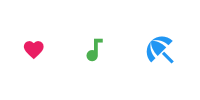
/// This example shows how to create a [Row] of [Icon]s in different colors and
/// sizes. The first [Icon] uses a [semanticLabel] to announce in accessibility
/// modes like TalkBack and VoiceOver.
///
/// 
///
/// ```dart
/// const Row(
/// mainAxisAlignment: MainAxisAlignment.spaceAround,
/// children: <Widget>[
/// Icon(
/// Icons.favorite,
/// color: Colors.pink,
/// size: 24.0,
/// semanticLabel: 'Text to announce in accessibility modes',
/// ),
/// Icon(
/// Icons.audiotrack,
/// color: Colors.green,
/// size: 30.0,
/// ),
/// Icon(
/// Icons.beach_access,
/// color: Colors.blue,
/// size: 36.0,
/// ),
/// ],
/// )
/// ```
/// {@end-tool}
///
/// See also:
///
/// * [IconButton], for interactive icons.
/// * [Icons], for the list of available Material Icons for use with this class.
/// * [IconTheme], which provides ambient configuration for icons.
/// * [ImageIcon], for showing icons from [AssetImage]s or other [ImageProvider]s.
class Icon extends StatelessWidget {
/// Creates an icon.
const Icon(
this.icon, {
super.key,
this.size,
this.fill,
this.weight,
this.grade,
this.opticalSize,
this.color,
this.shadows,
this.semanticLabel,
this.textDirection,
this.applyTextScaling,
}) : assert(fill == null || (0.0 <= fill && fill <= 1.0)),
assert(weight == null || (0.0 < weight)),
assert(opticalSize == null || (0.0 < opticalSize));
/// The icon to display. The available icons are described in [Icons].
///
/// The icon can be null, in which case the widget will render as an empty
/// space of the specified [size].
final IconData? icon;
/// The size of the icon in logical pixels.
///
/// Icons occupy a square with width and height equal to size.
///
/// Defaults to the nearest [IconTheme]'s [IconThemeData.size].
///
/// If this [Icon] is being placed inside an [IconButton], then use
/// [IconButton.iconSize] instead, so that the [IconButton] can make the splash
/// area the appropriate size as well. The [IconButton] uses an [IconTheme] to
/// pass down the size to the [Icon].
final double? size;
/// The fill for drawing the icon.
///
/// Requires the underlying icon font to support the `FILL` [FontVariation]
/// axis, otherwise has no effect. Variable font filenames often indicate
/// the supported axes. Must be between 0.0 (unfilled) and 1.0 (filled),
/// inclusive.
///
/// Can be used to convey a state transition for animation or interaction.
///
/// Defaults to nearest [IconTheme]'s [IconThemeData.fill].
///
/// See also:
/// * [weight], for controlling stroke weight.
/// * [grade], for controlling stroke weight in a more granular way.
/// * [opticalSize], for controlling optical size.
final double? fill;
/// The stroke weight for drawing the icon.
///
/// Requires the underlying icon font to support the `wght` [FontVariation]
/// axis, otherwise has no effect. Variable font filenames often indicate
/// the supported axes. Must be greater than 0.
///
/// Defaults to nearest [IconTheme]'s [IconThemeData.weight].
///
/// See also:
/// * [fill], for controlling fill.
/// * [grade], for controlling stroke weight in a more granular way.
/// * [opticalSize], for controlling optical size.
/// * https://fonts.google.com/knowledge/glossary/weight_axis
final double? weight;
/// The grade (granular stroke weight) for drawing the icon.
///
/// Requires the underlying icon font to support the `GRAD` [FontVariation]
/// axis, otherwise has no effect. Variable font filenames often indicate
/// the supported axes. Can be negative.
///
/// Grade and [weight] both affect a symbol's stroke weight (thickness), but
/// grade has a smaller impact on the size of the symbol.
///
/// Grade is also available in some text fonts. One can match grade levels
/// between text and symbols for a harmonious visual effect. For example, if
/// the text font has a -25 grade value, the symbols can match it with a
/// suitable value, say -25.
///
/// Defaults to nearest [IconTheme]'s [IconThemeData.grade].
///
/// See also:
/// * [fill], for controlling fill.
/// * [weight], for controlling stroke weight in a less granular way.
/// * [opticalSize], for controlling optical size.
/// * https://fonts.google.com/knowledge/glossary/grade_axis
final double? grade;
/// The optical size for drawing the icon.
///
/// Requires the underlying icon font to support the `opsz` [FontVariation]
/// axis, otherwise has no effect. Variable font filenames often indicate
/// the supported axes. Must be greater than 0.
///
/// For an icon to look the same at different sizes, the stroke weight
/// (thickness) must change as the icon size scales. Optical size offers a way
/// to automatically adjust the stroke weight as icon size changes.
///
/// Defaults to nearest [IconTheme]'s [IconThemeData.opticalSize].
///
/// See also:
/// * [fill], for controlling fill.
/// * [weight], for controlling stroke weight.
/// * [grade], for controlling stroke weight in a more granular way.
/// * https://fonts.google.com/knowledge/glossary/optical_size_axis
final double? opticalSize;
/// The color to use when drawing the icon.
///
/// Defaults to the nearest [IconTheme]'s [IconThemeData.color].
///
/// The color (whether specified explicitly here or obtained from the
/// [IconTheme]) will be further adjusted by the nearest [IconTheme]'s
/// [IconThemeData.opacity].
///
/// {@tool snippet}
/// Typically, a Material Design color will be used, as follows:
///
/// ```dart
/// Icon(
/// Icons.widgets,
/// color: Colors.blue.shade400,
/// )
/// ```
/// {@end-tool}
final Color? color;
/// A list of [Shadow]s that will be painted underneath the icon.
///
/// Multiple shadows are supported to replicate lighting from multiple light
/// sources.
///
/// Shadows must be in the same order for [Icon] to be considered as
/// equivalent as order produces differing transparency.
///
/// Defaults to the nearest [IconTheme]'s [IconThemeData.shadows].
final List<Shadow>? shadows;
/// Semantic label for the icon.
///
/// Announced in accessibility modes (e.g TalkBack/VoiceOver).
/// This label does not show in the UI.
///
/// * [SemanticsProperties.label], which is set to [semanticLabel] in the
/// underlying [Semantics] widget.
final String? semanticLabel;
/// The text direction to use for rendering the icon.
///
/// If this is null, the ambient [Directionality] is used instead.
///
/// Some icons follow the reading direction. For example, "back" buttons point
/// left in left-to-right environments and right in right-to-left
/// environments. Such icons have their [IconData.matchTextDirection] field
/// set to true, and the [Icon] widget uses the [textDirection] to determine
/// the orientation in which to draw the icon.
///
/// This property has no effect if the [icon]'s [IconData.matchTextDirection]
/// field is false, but for consistency a text direction value must always be
/// specified, either directly using this property or using [Directionality].
final TextDirection? textDirection;
/// Whether to scale the size of this widget using the ambient [MediaQuery]'s [TextScaler].
///
/// This is specially useful when you have an icon associated with a text, as
/// scaling the text without scaling the icon would result in a confusing
/// interface.
///
/// Defaults to the nearest [IconTheme]'s
/// [IconThemeData.applyTextScaling].
final bool? applyTextScaling;
@override
Widget build(BuildContext context) {
assert(this.textDirection != null || debugCheckHasDirectionality(context));
final TextDirection textDirection = this.textDirection ?? Directionality.of(context);
final IconThemeData iconTheme = IconTheme.of(context);
final bool applyTextScaling = this.applyTextScaling ?? iconTheme.applyTextScaling ?? false;
final double tentativeIconSize = size ?? iconTheme.size ?? kDefaultFontSize;
final double iconSize = applyTextScaling ? MediaQuery.textScalerOf(context).scale(tentativeIconSize) : tentativeIconSize;
final double? iconFill = fill ?? iconTheme.fill;
final double? iconWeight = weight ?? iconTheme.weight;
final double? iconGrade = grade ?? iconTheme.grade;
final double? iconOpticalSize = opticalSize ?? iconTheme.opticalSize;
final List<Shadow>? iconShadows = shadows ?? iconTheme.shadows;
final IconData? icon = this.icon;
if (icon == null) {
return Semantics(
label: semanticLabel,
child: SizedBox(width: iconSize, height: iconSize),
);
}
final double iconOpacity = iconTheme.opacity ?? 1.0;
Color iconColor = color ?? iconTheme.color!;
if (iconOpacity != 1.0) {
iconColor = iconColor.withOpacity(iconColor.opacity * iconOpacity);
}
final TextStyle fontStyle = TextStyle(
fontVariations: <FontVariation>[
if (iconFill != null) FontVariation('FILL', iconFill),
if (iconWeight != null) FontVariation('wght', iconWeight),
if (iconGrade != null) FontVariation('GRAD', iconGrade),
if (iconOpticalSize != null) FontVariation('opsz', iconOpticalSize),
],
inherit: false,
color: iconColor,
fontSize: iconSize,
fontFamily: icon.fontFamily,
package: icon.fontPackage,
fontFamilyFallback: icon.fontFamilyFallback,
shadows: iconShadows,
height: 1.0, // Makes sure the font's body is vertically centered within the iconSize x iconSize square.
leadingDistribution: TextLeadingDistribution.even,
);
Widget iconWidget = RichText(
overflow: TextOverflow.visible, // Never clip.
textDirection: textDirection, // Since we already fetched it for the assert...
text: TextSpan(
text: String.fromCharCode(icon.codePoint),
style: fontStyle,
),
);
if (icon.matchTextDirection) {
switch (textDirection) {
case TextDirection.rtl:
iconWidget = Transform(
transform: Matrix4.identity()..scale(-1.0, 1.0, 1.0),
alignment: Alignment.center,
transformHitTests: false,
child: iconWidget,
);
case TextDirection.ltr:
break;
}
}
return Semantics(
label: semanticLabel,
child: ExcludeSemantics(
child: SizedBox(
width: iconSize,
height: iconSize,
child: Center(
child: iconWidget,
),
),
),
);
}
@override
void debugFillProperties(DiagnosticPropertiesBuilder properties) {
super.debugFillProperties(properties);
properties.add(IconDataProperty('icon', icon, ifNull: '<empty>', showName: false));
properties.add(DoubleProperty('size', size, defaultValue: null));
properties.add(DoubleProperty('fill', fill, defaultValue: null));
properties.add(DoubleProperty('weight', weight, defaultValue: null));
properties.add(DoubleProperty('grade', grade, defaultValue: null));
properties.add(DoubleProperty('opticalSize', opticalSize, defaultValue: null));
properties.add(ColorProperty('color', color, defaultValue: null));
properties.add(IterableProperty<Shadow>('shadows', shadows, defaultValue: null));
properties.add(StringProperty('semanticLabel', semanticLabel, defaultValue: null));
properties.add(EnumProperty<TextDirection>('textDirection', textDirection, defaultValue: null));
properties.add(DiagnosticsProperty<bool>('applyTextScaling', applyTextScaling, defaultValue: null));
}
}