Wikipedia:Featured picture candidates/NGC7293 (2004).jpg
Appearance


- Reason
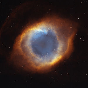
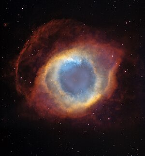
- Oh no, not another nebula! I found this doing comparison surfing for the recent nomination, and noticed the picture in the Helix Nebula article was of low resolution. I discovered the hubblesite.org versions and extracted those two from the full resolution tiff files. Both versions are centered, cropped and downsampled to a manageable file size. No other edits were made. I'm indifferent between the two versions here, so I'm posting them both for your consideration. On the Nebula itself, hubblesite calls it "one of the largest and most detailed celestial images ever made". Both versions are composites of a nine-image Hubble panorama and ground-based images. The Helix Nebula is only 650 light years away, which accounts for the high level of detail. This is the visible light version of the nebula, the infrared version is currently up for FPC at Commons, but in my opinion this one is far superior. ~ trialsanderrors 20:58, 26 February 2007 (UTC)
- Articles this image appears in
- Helix Nebula
- Creator
- Alternative 1: NASA, NOAO, ESA, the Hubble Helix Nebula Team, M. Meixner (STScI), and T.A. Rector (NRAO)
- Alternative 2: NASA, ESA, and C.R. O'Dell (Vanderbilt University)
- Nominator
- trialsanderrors
- Support — trialsanderrors 20:58, 26 February 2007 (UTC)
- Support JoshHolloway 21:57, 26 February 2007 (UTC)
- Strong Support Alternative 2 - Yes, definitely number 2. The encyclopedic quality is very high, the image dimensions are high, and the image quality is high - you can see the white dwarf in the middle clearly. I'm going to put this on my user page, I like it so much! Mrug2 23:42, 26 February 2007 (UTC)
- Comment - What's up with the 1px horizontal lines in the red on the left-hand side? One that initially caught my eye can be found between approx [450px,2175px] and [825px,2175px] (about 2/3 down the image vertically). I wouldn't ordinarily be this picky, but it really jumped out at me... tiZom(2¢) 04:28, 27 February 2007 (UTC)
- Weak neutral :) per Tomtheman and general graininess where there should be absolutely none (the black of space) --frothT 04:49, 27 February 2007 (UTC)
- The line looks like a stitching error. Those are fairly complicated panoramas from my understanding. The original tiff is quite a bit bigger, so I think I can fix it without loss of information. On the background noise, I just checked the last featured nebula and it's there too. The consensus seems to be not to retouch astronomical images unless necessary and accept some flaws that stem from the complexity of creating them. ~ trialsanderrors 06:14, 27 February 2007 (UTC)
- Support 2. This has been one of my favorite Hubble images for years. — BRIAN0918 • 2007-02-27 15:23Z
- Support 2. Great "eye in the sky"! --Janke | Talk 16:46, 27 February 2007 (UTC)
- Support 2. --Flex (talk|contribs) 20:15, 27 February 2007 (UTC)
- Support both - As said above, this was also my favorite Hubble photo for years. I like both of them. The second one is new for me and I think it's sort of better and the colors looks better too. --Arad 21:54, 27 February 2007 (UTC)
- Support 2 - And please make it stop lookin' at me... tiZom(2¢) 18:39, 1 March 2007 (UTC)
- Weak support 2, against 1 - Picture 1 is slightly grainy around the central white dwarf. Picture 2 is nice, but I'm supersaturated with HST images of big things. Zoomed in images are more intriguing. --zandperl 03:54, 6 March 2007 (UTC)
Promoted Image:NGC7293 (2004).jpg --KFP (talk | contribs) 19:06, 7 March 2007 (UTC)